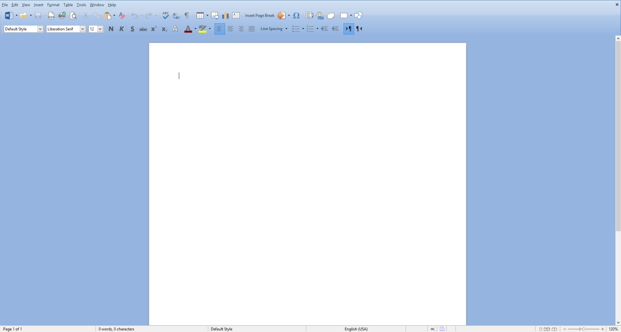
If reading my last post has gotten you jumping on the LibreOffice train, you may be finding yourself thinking right now: “Eww, that thing looks like Office 97!” Because, well…yeah, it kinda does. While a UI overhaul is a frequent topic for discussion in LibreOffice circles, to date the makers of the software have been reluctant to incorporate any significant updates to the office suite’s look and feel. But this is open source software. It exists on your terms, not the other way around. While the default configuration may be none too adventurous, it’s actually relatively simple to shake things up for yourself and get a pretty radically different-looking office suite. You could even clone the basic appearance of recent versions of Microsoft Office if you like. Here’s how it’s done:

Disable rulers when you aren’t using them
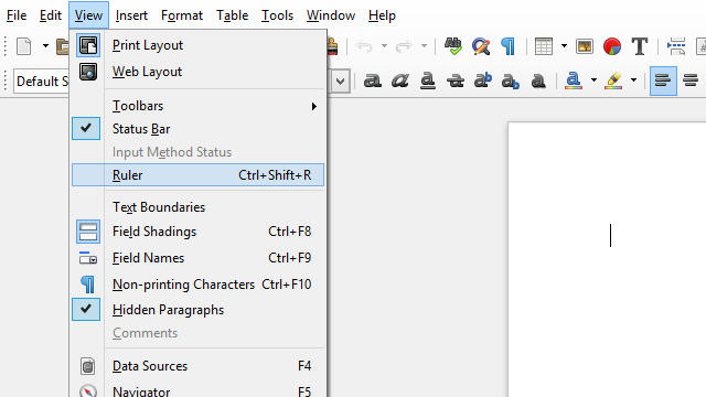
Having rulers surrounding your document can be great whenever you need to get a feel for real-world size or just general precision, but to be honest, that isn’t very often. And in the meantime those rulers just sit there taking up screen real estate and looking all business-y. It may sound like a small thing, but trust me: uncheck that box next to View > Rulers and your workspace will feel much cleaner and more elegant already.
Install a persona
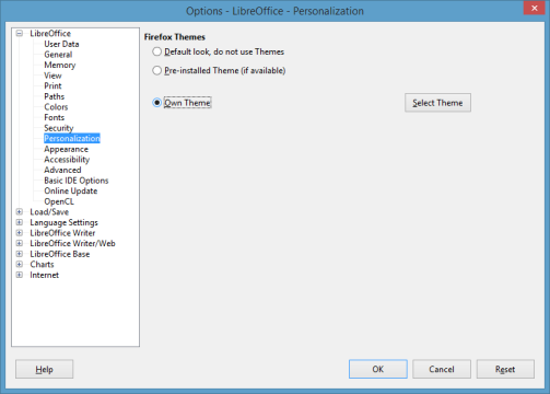
One rather under-advertised feature of LibreOffice is the ability to use Firefox personas (themes, of sorts) to customize the header and certain other UI elements. So start by heading on over to the Firefox persona catalog and browse to find something you like. If you’re actually using Firefox you can even mouse-over the themes to get a live preview in your browser itself. One of my personal favorites is Clean Blue.
Once you’ve picked out a persona to try, head back over to LibreOffice and navigate to Tools > Options. The configuration window that appears is where most of the magic will happen from here. Go to the Personalization tab and under the Persona field check the radio button to enable using your own persona. Then choose ‘Select Theme’ and either paste the URL to the persona of your choice (LibreOffice <4.3) or search for it by title (LibreOffice >4.4). It will take a few seconds to apply, so be patient: LibreOffice has not frozen. Click ‘OK’ on all open configuration menus to see the changes. Not a bad start, huh?
Use a custom background color

But wait, there’s more! Chances are even the nicest persona will look a little out of place set against LibreOffice’s drab gray color scheme everywhere else. Fortunately there’s a way to fix that that guarantees LibreOffice looks great with any persona: creating a custom background color to match.
First, grab a screenshot of LibreOffice with the Print Screen key and paste it into the image editor of your choice (Paint is sufficient). Next, use an eyedropper tool to pick the color at the very edge of your LibreOffice header with a persona applied. With this color selected, go into your color editor and take note of the precise RGB values.
Next, return to LibreOffice, head back into your Tools > Options menu, and this time switch to the ‘Colors’ tab. Enter a name for your new color in the name field, then fill the RGB fields with the values from your image editor. If the preview looks good, hit ‘Add’ and your new color will be created.
To put it to good use, switch to the ‘Appearance’ tab and select your new color from the drop-down box next to ‘Application Background’. Apply changes and you’ll now have a clean, consistent, eye-catching UI to look at!
Use large icons
A certain funny trend has taken place over the past couple of decades: while hardware developers have consistently worked hard to increase screen resolution as much as possible, software developers have often forgotten to keep up. This has led to the miniaturization of many UI elements that really are better off being big and bold—and originally were, until our screens outgrew them. Microsoft actually remedied this problem a bit ahead of the game with the advent of the Ribbon UI in Office 2007, but open source alternatives largely have yet to figure it out. I say ‘largely’ because everything is an option with open source; in this case it just happens to be disabled by default. To change that, go to Tools > Options and select the ‘View’ tab. Here you can set LibreOffice’s icon size to ‘Large’ or even scale up the entire UI (may be desirable on smaller laptops).
Use custom icons
Another not-so-well-known feature of LibreOffice is that it actually supports custom icon themes, and in fact even comes with a few to choose from. This can also be done in the ‘View’ tab of LibreOffice’s options screen—directly beside the icon size option, in fact—but it’s not immediately obvious how to add additional icon themes to the small roster of included ones.
LibreOffice icon themes are stored in simple .zip files with the naming structure “images_themename.zip” under “…\share\config” in your LibreOffice program folder (in Windows this would be “C:\Program Files (x86)\LibreOffice 4\share\config”). To add more, simply locate and download the icon theme pack of your choice and drop the .zip in this folder. Even though it’s a Linux-oriented website, gnome-look.org and its family of related sites are good places to find one, as LibreOffice icon themes are platform-independent. A handful can also be found around the likes of DeviantArt, such as this one that imitates Microsoft Office 2013, for starters.
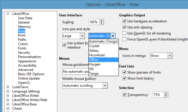
And there you have it: five easy tweaks that can seriously spruce up any LibreOffice workspace. You just went from Office 97 to having more color than Office 2013! And best of all: it’s your theme. By mixing and matching available personas, icon themes, and color palettes, you can create the best and most productive office suite for you, personally, and that’s pretty awesome.


